Data visualization
The adage "a picture is worth a thousand words" describes the goal of data visualization appropriately. Data visualization seeks to present information in a concise, yet comprehensible form. Visualizations can emphasize important points and provide the user with useful things, such as summaries of data.

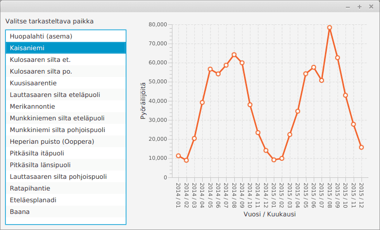
When comparing the statistics shown in the image to file format - a few lines have been shown below as an example - the benefits are evident. In the original data set the values are presented on an hourly basis, whereas monthly summaries have been generated from the data for the visualization. The original set also contains all of the the places of inspection, whereas in the visualization the user is able to select a specific point.
Päivämäärä;Huopalahti (asema);Kaisaniemi;Kulosaaren silta et.;...
ke 1 tammi 2014 00:00;;1;;;;;;2;5;3;;11;;;7;8
ke 1 tammi 2014 01:00;;3;;;;;;6;5;1;;8;;;5;4
ke 1 tammi 2014 02:00;;3;;;;;;1;1;1;;14;;;2;11
ke 1 tammi 2014 03:00;;2;;;;;;0;2;0;;7;;;5;3
...
Data that's in the format shown above can be processed as strings row by row. The rows are split into pieces that can be processed using a list structure. One way of doing this is the following.
String row = "Päivämäärä;Huopalahti (asema);Kaisaniemi;Kulosaaren silta et.;..."
String[] pieces = row.split(";");
for (int i = 0; i < pieces.length; i++) {
    System.out.println(i + ": " + pieces[i]);
}We'll familiarize ourselves with some patterns used in data visualization, and a technique for visualizing changing data.
Charts
Java offers lots of pre-made classes for drawing different types of charts. The types of charts include, among others, area charts, bar charts, and line charts.
We are next going to take a look at using both a line and a bar chart. It might be worthwhile to also take a look at Oracle's guide on the subject, which can be found here: https://docs.oracle.com/javafx/2/charts/jfxpub-charts.htm.
Line Chart
Line charts can be used to illustrate change that happens over time. The data is illustrated as a line that connects dots in a two-dimencional coordinate system, where the x-axis represents time, and the y-axis the value of the variable at each point in time. A line chart can also contain many different variables.
Let's use a line chart on some real-world data. Statistics Finland offers data on the total votes and relative percentage of votes in the Finnish communal elections for the years 1968-2008. The original data can be found at https://tilastokeskus.fi/til/kvaa/2008/kvaa_2008_2010-07-30_tau_002.html. A few data points have been drawn from it for visualization purposes — we'll be focusing on the relative share of the votes here. Our data below uses tabs for separation (i.e., the character '\t').
Party	1968	1972	1976	1980	1984	1988	1992	1996	2000	2004	2008
KOK	16.1	18.1	20.9	22.9	23.0	22.9	19.1	21.6	20.8	21.8	23.4
SDP	23.9	27.1	24.8	25.5	24.7	25.2	27.1	24.5	23.0	24.1	21.2
KESK	18.9	18.0	18.4	18.7	20.2	21.1	19.2	21.8	23.8	22.8	20.1
VIHR	-	-	-	-	2.8	2.3	6.9	6.3	7.7	7.4	8.9
VAS	16.9	17.5	18.5	16.6	13.1	12.6	11.7	10.4	9.9	9.6	8.8
PS	7.3	5.0	2.1	3.0	5.3	3.6	2.4	0.9	0.7	0.9	5.4
RKP	5.6	5.2	4.7	4.7	5.1	5.3	5.0	5.4	5.1	5.2	4.7
It's possible to split one of the rows above in the following manner:
String row = "Party	1968	1972	1976	1980	1984	1988"
List<String> pieces = Arrays.asList(row.split("\t"));
for (int i = 0; i < pieces.size(); i++) {
    System.out.println(i + ": " + pieces.get(i));
}0: Party 1: 1968 2: 1972 3: 1976 4: 1980 5: 1984 6: 1988
Using a line chart requires that we define the axes of the coordinate system, create the line chart that uses those axes, and insert the data into the line chart. Our first conceptualization of the application is as follows. The progam attempts to visualize the support enjoyed by the RKP party in the years 1968-2008.
@Override
public void start(Stage stage) {
    // create the x and y axes that the chart is going to use
    NumberAxis xAxis = new NumberAxis();
    NumberAxis yAxis = new NumberAxis();

    // set the titles for the axes
    xAxis.setLabel("Year");
    yAxis.setLabel("Relative support (%)");


    // create the line chart. The values of the chart are given as numbers
    // and it uses the axes we created earlier
    LineChart<Number, Number> lineChart = new LineChart<>(xAxis, yAxis);
    lineChart.setTitle("Relative support in the years 1968-2008");

    // create the data set that is going to be added to the line chart
    XYChart.Series rkpData = new XYChart.Series();
    rkpData.setName("RKP");
    // and single points into the data set
    rkpData.getData().add(new XYChart.Data(1968, 5.6));
    rkpData.getData().add(new XYChart.Data(1972, 5.2));
    rkpData.getData().add(new XYChart.Data(1976, 4.7));
    rkpData.getData().add(new XYChart.Data(1980, 4.7));
    rkpData.getData().add(new XYChart.Data(1984, 5.1));
    rkpData.getData().add(new XYChart.Data(1988, 5.3));
    rkpData.getData().add(new XYChart.Data(1992, 5.0));
    rkpData.getData().add(new XYChart.Data(1996, 5.4));
    rkpData.getData().add(new XYChart.Data(2000, 5.1));
    rkpData.getData().add(new XYChart.Data(2004, 5.2));
    rkpData.getData().add(new XYChart.Data(2008, 4.7));

    // add the data set to the line chart
    lineChart.getData().add(rkpData);

    // display the line chart
    Scene view = new Scene(lineChart, 640, 480);
    stage.setScene(view);
    stage.show();
}
When we start the program, we notice a few problems (try it out and see what the data looks like). The class that we've used to create the axes, NumberAxis, happens to offer another constructor as well. You can give the lower and upper bounds as parameters to the constructor, as well as the number of ticks betwen them. Let's set the lower bound as 1968, the upper bound as 2008, and the number of ticks as 4.
@Override
public void start(Stage stage) {
    // create the x and y axis
    NumberAxis xAxis= new NumberAxis(1968, 2008, 4);
    // .. the rest of the code stays the same
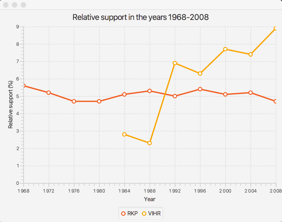
Adding the numbers of support for another party to the program can be done in a similar manner. In the example below, we add the party VIHR to the chart — the party has been active since the year 1984.
@Override
public void start(Stage stage) {
    // create the x and y axes that the chart is going to use
    NumberAxis xAxis = new NumberAxis();
    NumberAxis yAxis = new NumberAxis();

    // set the titles for the axes
    xAxis.setLabel("Year");
    yAxis.setLabel("Relative support (%)");


    // create the line chart. The values of the chart are given as numbers
    // and it uses the axes we created earlier
    LineChart<Number, Number> lineChart = new LineChart<>(xAxis, yAxis);
    lineChart.setTitle("Relative support in the years 1968-2008");

    // create the data set that is going to be added to the line chart
    XYChart.Series rkpData = new XYChart.Series();
    rkpData.setName("RKP");
    // and single points into the data set
    rkpData.getData().add(new XYChart.Data(1968, 5.6));
    rkpData.getData().add(new XYChart.Data(1972, 5.2));
    rkpData.getData().add(new XYChart.Data(1976, 4.7));
    rkpData.getData().add(new XYChart.Data(1980, 4.7));
    rkpData.getData().add(new XYChart.Data(1984, 5.1));
    rkpData.getData().add(new XYChart.Data(1988, 5.3));
    rkpData.getData().add(new XYChart.Data(1992, 5.0));
    rkpData.getData().add(new XYChart.Data(1996, 5.4));
    rkpData.getData().add(new XYChart.Data(2000, 5.1));
    rkpData.getData().add(new XYChart.Data(2004, 5.2));
    rkpData.getData().add(new XYChart.Data(2008, 4.7));

    // add the data set to the line chart
    lineChart.getData().add(rkpData);

    // create another data set that's going to be added to the chart
    XYChart.Series vihrData = new XYChart.Series();
    vihrData.setName("VIHR");
    // and single data points into the data set
    vihrData.getData().add(new XYChart.Data(1984, 2.8));
    vihrData.getData().add(new XYChart.Data(1988, 2.3));
    vihrData.getData().add(new XYChart.Data(1992, 6.9));
    vihrData.getData().add(new XYChart.Data(1996, 6.3));
    vihrData.getData().add(new XYChart.Data(2000, 7.7));
    vihrData.getData().add(new XYChart.Data(2004, 7.4));
    vihrData.getData().add(new XYChart.Data(2008, 8.9));

    // add the data set to the line chart
    lineChart.getData().add(vihrData);

    // display the line chart
    Scene view = new Scene(lineChart, 640, 480);
    stage.setScene(view);
    stage.show();
}
The program should look like this when started.

Each data point was manually added above to the program code — given that we're programmers, this approach feels clumsy. The solution is to read the data into a suitable data structure, after which we can go through the structure and add the data contained in it to the chart. A good candidate for this data structure is a hash map that uses the names of the parties as its keys. The values of the hash table are pairs of numbers that represent the year and the corresponding support number. It's now much more straightforward to add data into the chart.
// the axes and the line chart created previously

// data has been read earlier -- the following object contains the data
Map<String, Map<Integer, Double>> values = // created elsewhere

// go through the parties and add them to the chart
values.keySet().stream().forEach(party -> {
    // a different data set for every party
    XYChart.Series data = new XYChart.Series();
    data.setName(party);

    // add the party's support numbers to the data set
    values.get(party).entrySet().stream().forEach(pair -> {
        data.getData().add(new XYChart.Data(pair.getKey(), pair.getValue()));
    });

    // and add the data set to the chart
    lineChart.getData().add(data);
});Bar Charts
Bar charts are used to visualize categorical data. The data is represented as bars — each bar represents a certain category, and its height (or length) represents the value associated with the category. Examples of data that could well be illustrated with bar charts are populations of countries or the market shares of stores or products.
Let's take a look at using a bar chart to visualize the population figures of the Nordic countries. The used data is from the Wikipedia article on the Nordic countries (retrieved 6.12.2019, populations are estimates from the year 2018).
Iceland, 343518
Norway, 5372191
Sweden, 10313447
Finland, 5537364
Denmark, 5809502
We'll use the JavaFx [BarChart] class (https://docs.oracle.com/javase/8/javafx/api/javafx/scene/chart/BarChart.html). As with line charts, the axes have to be defined and data has to be added to the chart. In this case, however, we're going to take advantage of the categorical CategoryAxis class to define the x axis. With the CategoryAxis class, the type of the axis values is String. This must also be accounted for in the data that is going to be added to the chart.
Iceland, 343518
Norway, 5372191
Sweden, 10313447
Finland, 5537364
Denmark, 5809502
@Override
public void start(Stage stage) {
    CategoryAxis xAxis = new CategoryAxis();
    NumberAxis yAxis = new NumberAxis();
    BarChart<String, Number> barChart = new BarChart<>(xAxis, yAxis);

    barChart.setTitle("Populations of the Nordic countries");
    barChart.setLegendVisible(false);

    XYChart.Series populations = new XYChart.Series();
    populations.getData().add(new XYChart.Data("Sweden", 10313447));
    populations.getData().add(new XYChart.Data("Denmark", 5809502));
    populations.getData().add(new XYChart.Data("Finland", 5537364));
    populations.getData().add(new XYChart.Data("Norway", 5372191));
    populations.getData().add(new XYChart.Data("Iceland", 343518));

    barChart.getData().add(populations);
    Scene view = new Scene(barChart, 640, 480);
    stage.setScene(view);
    stage.show();
}Log in to view the quiz
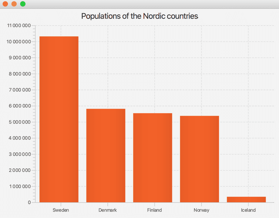
The source code above produces the following chart.

As you notice, since the x-axis is defined with the CategoryAxis class, the chart follows the order in which the categories are supplied to the program. In the previous example, the countries were ordered by population. Try to modify the program so that the chart orders the Nordic countries by name. After launching the application you may be able to understand why this form of visualization is hardly used...
Visualizing Dynamic Data
Software is also used to visualize contunually changing information. As an example, the software used to track share prices is constantly searching for the latest share prices and displaying that information to the user. Similarly, weather software retrieves data from stations and displays the most recent information to the user. Software developed for monitoring server-side software works in the same way by pinging the various parts of the server-side software at certain intervals to check for responses.
@Override
public void start(Stage stage) {
    // The class Random is used to randomize the dice rolls
    Random random = new Random();

    NumberAxis xAxis = new NumberAxis();
    // y-axes represents the average of the rolls. The average is always between [1-6]
    NumberAxis yAxis = new NumberAxis(1, 6, 1);

    LineChart<Number, Number> lineChart = new LineChart<>(xAxis, yAxis);
    // removing elements of the chart, e.g. circles on points
    lineChart.setLegendVisible(false);
    lineChart.setAnimated(false);
    lineChart.setCreateSymbols(false);

    // we create a variable representing the data and add it to the chart
    XYChart.Series average = new XYChart.Series();
    lineChart.getData().add(average);

    new AnimationTimer() {
        private long previous;
        private long sum;
        private long count;

        @Override
        public void handle(long current) {
            if (current - previous < 100_000_000L) {
                return;
            }

            previous = current;

            // roll the dice
            int number = random.nextInt(6) + 1;

            // we grow the sum and increment the count
            sum += number;
            count++;

            // we add a new data point to the chart
            average.getData().add(new XYChart.Data(count, 1.0 * sum / count));
        }
    }.start();

    Scene scene = new Scene(lineChart, 400, 300);
    stage.setScene(scene);
    stage.show();
}
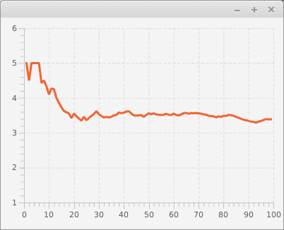
The image below shows an example of the application in use. The dice has been rolled nearly a 100 times in it.

Eagle-eyed readers may have noticed that the application's source code did not re-draw the chart as data was added. What on earth?
Charts such as LineChart and BarChart use a data structure that implements the ObservableList interface to store internal data. Collections that implement the ObservableList interface provide the ability to listen to changes in collections. When a new record is added to the list, such as a new data point for the mean, the list informs all of the objects listening to changes on the list of this change. Charts such as LineChart and BarChart are constructed internally in a way that they listen to changes in the information that they display. If the data changes, the chart is updated automatically.
In some situations we may only want to display the 100 most recent observations of the dynamically changing data. This can be done in the previous example by turning off the random value generation representing the x-axis of the NumberAxis object (the method setAutoRanging(false)), and by adding the following check to the end of the handle method of the AnimationTimer class.
if (average.getData().size() > 100) {
    average.getData().remove(0);
    xAxis.setLowerBound(xAxis.getLowerBound() + 1);
    xAxis.setUpperBound(xAxis.getUpperBound() + 1);
}
The application now only displays the last 100 observations to the user.
Remember to check your points from the ball on the bottom-right corner of the material!