UI components and their layout
Programmers typically use ready-made libraries for implementing graphical user interfaces. As an example, it would not make much sense to implement a button from scratch (which would require creating a class that draws a button and handles all of its functions) since pre-built button components can usually be found in existing libraries. Let's take a look now at some UI components.
Text can be displayed using the Label class. The Label class provides a UI component for which text can be set, and offers methods for modifying the text it contains. The displayed text is either set in the constructor, or by using the setText method.
package application;

import javafx.application.Application;
import javafx.scene.Scene;
import javafx.scene.control.Label;
import javafx.scene.layout.FlowPane;
import javafx.stage.Stage;

public class JavaFxApplication extends Application {

    @Override
    public void start(Stage window) {
        Label textComponent = new Label("Text element");

        FlowPane componentGroup = new FlowPane();
        componentGroup.getChildren().add(textComponent);

        Scene view = new Scene(componentGroup);

        window.setScene(view);
        window.show();
    }

    public static void main(String[] args) {
        launch(JavaFxApplication.class);
    }
}
Buttons can be added using the Button class. Buttons are added the same way as labels.
package application;

import javafx.application.Application;
import javafx.scene.Scene;
import javafx.scene.control.Button;
import javafx.scene.layout.FlowPane;
import javafx.stage.Stage;

public class JavaFxApplication extends Application {

    @Override
    public void start(Stage window) {
        Button buttonComponent = new Button("This is a button");

        FlowPane componentGroup = new FlowPane();
        componentGroup.getChildren().add(buttonComponent);

        Scene view = new Scene(componentGroup);

        window.setScene(view);
        window.show();
    }

    public static void main(String[] args) {
        launch(JavaFxApplication.class);
    }
}
You also have the ability to add multiple components at once. In the example below, both a button and a textComponent have been added.
package application;

import javafx.application.Application;
import javafx.scene.Scene;
import javafx.scene.control.Button;
import javafx.scene.control.Label;
import javafx.scene.layout.FlowPane;
import javafx.stage.Stage;

public class JavaFxApplication extends Application {

    @Override
    public void start(Stage window) {
        Button buttonComponent = new Button("This is a button");
        Label textComponent = new Label("Text element");

        FlowPane componentGroup = new FlowPane();
        componentGroup.getChildren().add(buttonComponent);
        componentGroup.getChildren().add(textComponent);

        Scene view = new Scene(componentGroup);

        window.setScene(view);
        window.show();
    }

    public static void main(String[] args) {
        launch(JavaFxSovellus.class);
    }
}
The application looks like this:

You can find a list of the available UI components on https://docs.oracle.com/javase/8/javafx/user-interface-tutorial/. The site also provides examples on how to use them.
There is a considerable amount of different UI components. Using online materials, such as the one linked above, is a good way to learn about them. When staring out, components should be tried out in isolation by adding a single component at a time and inspecting how it works.
Log in to view the quiz
As you become more familiar with the various components, using them becomes more straightforward. What's common to almost all of the components is the way that they're added to an interface - once you know how to add one, you can add almost any component to your interface.
The biggest difference in adding components is where they're placed on the interface. You'll soon learn more about the lay these components out.
UI Component Layout
Each UI component has its place on the interface. The location of a component is determined by the class used to layout the components.
In previous examples, we used a class called FlowPane to set up our front-end components. With FlowPane, components that you add to the interface are placed side-by-side. If the size of Window is reduced so that the components no longer fit next to eahch other, the components will be automatically aligned. In the image below, the application resulting from the previous example has been narrowed so that the components are automatically aligned.

BorderPane
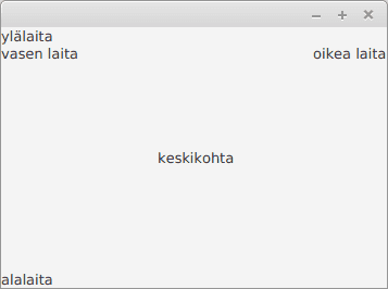
The BorderPane class lets you lay out components in five different primary positions: top, right, bottom, left and center. Traditional applications such as the web browser you are using take advantage of this layout. There's a menu and address bar at the top, and in the middle is the content of the page.
package application;

import javafx.application.Application;
import javafx.scene.Scene;
import javafx.scene.control.Label;
import javafx.scene.layout.BorderPane;
import javafx.stage.Stage;

public class JavaFxSovellus extends Application {

    @Override
    public void start(Stage window) {
        BorderPane layout = new BorderPane();
        layout.setTop(new Label("top"));
        layout.setRight(new Label("right"));
        layout.setBottom(new Label("bottom"));
        layout.setLeft(new Label("left"));
        layout.setCenter(new Label("center"));

        Scene view = new Scene(layout);

        window.setScene(view);
        window.show();
    }

    public static void main(String[] args) {
        launch(JavaFxSovellus.class);
    }
}
HBox
HBox-class enables UI components to be laid out in a single horizontal row.
@Override
public void start(Stage window) {
    HBox layout = new HBox();

    layout.getChildren().add(new Label("first"));
    layout.getChildren().add(new Label("second"));
    layout.getChildren().add(new Label("third"));

    Scene view = new Scene(layout);

    window.setScene(view);
    window.show();
}
As evident from the previous example, HBox by default completely glues the UI components to each other. We can use the setSpacing method to add space in between the components.
@Override
public void start(Stage window) {
    HBox layout = new HBox();
    layout.setSpacing(10);

    layout.getChildren().add(new Label("first"));
    layout.getChildren().add(new Label("second"));
    layout.getChildren().add(new Label("third"));

    Scene view = new Scene(layout);

    window.setScene(view);
    window.show();
}
The class VBox works in a similar way, but instead sets the components in a vertical column.

GridPane
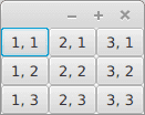
The GridPane class can be used to lay the UI components in a grid. In the example below, we create a 3x3 row in which each cell contains a button.
@Override
public void start(Stage window) {
    GridPane layout = new GridPane();

    for (int x = 1; x <= 3; x++) {
        for (int y = 1; y <= 3; y++) {
            layout.add(new Button("" + x + ", " + y), x, y);
        }
    }

    Scene view = new Scene(layout);

    window.setScene(view);
    window.show();
}
Multiple Layouts ons a Single Interface
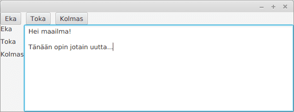
Layout components can be combined. A typical setup involves using the BorderPane layout as the base with other layouts inside it. In the example below, the top of the BorderPane contains a HBox used for horizontal layout and a VBox used for vertical layouts. A text box has been placed placed in the center.
package application;

import javafx.application.Application;
import javafx.scene.Scene;
import javafx.scene.control.Button;
import javafx.scene.control.Label;
import javafx.scene.control.TextArea;
import javafx.scene.layout.BorderPane;
import javafx.scene.layout.HBox;
import javafx.scene.layout.VBox;
import javafx.stage.Stage;

public class JavaFxSovellus extends Application {

    @Override
    public void start(Stage window) {
        BorderPane layout = new BorderPane();

        HBox buttons = new HBox();
        buttons.setSpacing(10);
        buttons.getChildren().add(new Button("First"));
        buttons.getChildren().add(new Button("Second"));
        buttons.getChildren().add(new Button("Third"));

        VBox texts = new VBox();
        texts.setSpacing(10);
        texts.getChildren().add(new Label("First"));
        texts.getChildren().add(new Label("Second"));
        texts.getChildren().add(new Label("Third"));

        layout.setTop(buttons);
        layout.setLeft(texts);

        layout.setCenter(new TextArea(""));

        Scene view = new Scene(layout);

        window.setScene(view);
        window.show();
    }

    public static void main(String[] args) {
        launch(JavaFxSovellus.class);
    }
}
Remember to check your points from the ball on the bottom-right corner of the material!